Advanced Properties
WOW! We’ve done a lot!
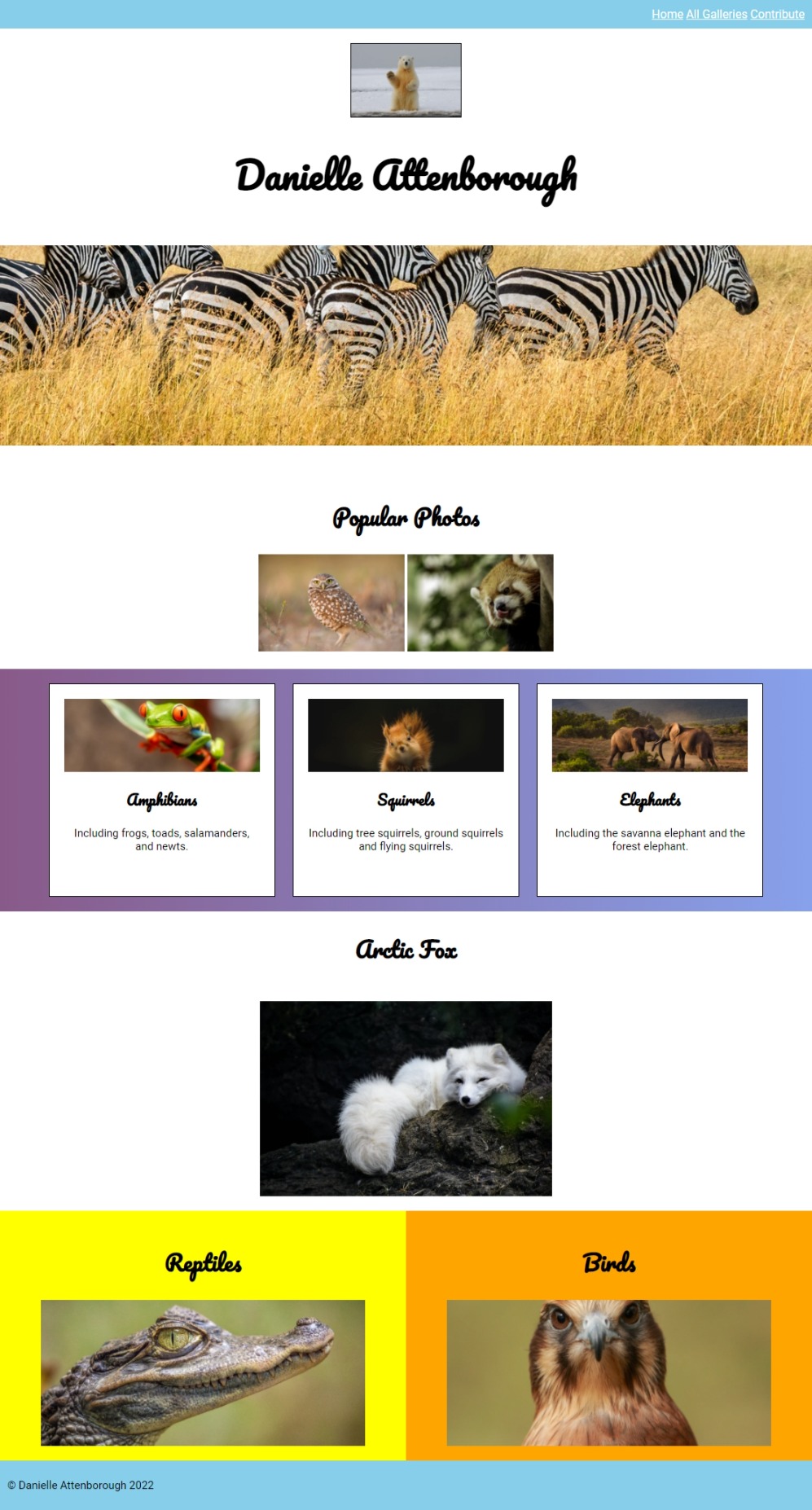
If you’ve been through every step of this tutorial, then your page should look like this:
It’s looking pretty good! Let’s add some fun styles now…
Paralax
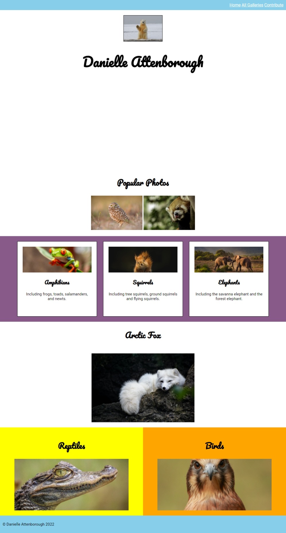
Firstly, what’s with that big gap between the heading and the “Popular Photos”? We’ve been saving it for a photo…
We can insert images using CSS. Add the following to your CSS file:
#section-1 {
	height: 300px;
+	background-image: url("");
}
Here's an image url you can use.
That will insert the image as the background for the section-1 element.
Make sure you can see the image appear on the page.
Next, we’ll position it a bit better so we can see the center of the image:
#section-1 {
	height: 300px;
	background-image: url("");
+    background-position: center;
+    background-size: cover;
}
Finally, we’ll fix it in place. This means that we we scroll the image will appear as if it is staying in place, creating a cool paralax effect.
Add the following to your css:
#section-1 {
	height: 300px;
	background-image: url("");
    background-position: center;
    background-size: cover;
+	background-attachment: fixed;
}
Scroll and see what happens!
Gradients
So far we’ve just used solid colours for our backgrounds, but we can actually make gradients too.
Try changing your CSS to use a gradient behind the cards:
#section-3 {
- 	background-color: #885A89;
+	background: linear-gradient(90deg, #885A89 0%, #87A1EB 100%);
	padding: 20px;
}
Have a play with the direction and colours of the gradient. Here’s a cool tool for creating gradients if you need inspiration.
Shadows
We could also add some shadows to make some elements feel as though they are lifted from the page.
Try adding a shadow to the h1 text:
h1 {
	font-family: 'Pacifico', cursive;
	font-size: 50px;
+	text-shadow: 1px 1px 2px #000000;
}
And try adding a shadow to the cards:
header img {
	height: 100px;
	border: 1px solid #000;
+	box-shadow: 1px 1px 2px #000000;
}
Try adding text or box shadows to other elements! Here’s a handy tool for generating shadows .
Here’s how our page looks like completed, hopefully you’ve made yours your own!