Sizing
The images on our page are all enormous, so let’s start by learning how to specify the size of elements.
Step 1
Add the following to your CSS:
/* Your CSS here */

+img {
+	height: 100px;
+}
The tag selector will get every img element.
The height property changes the height of an element by whatever value you provide - in this case, we’ve specified 100 pixels (px).
Every image on the page should now have the same height.
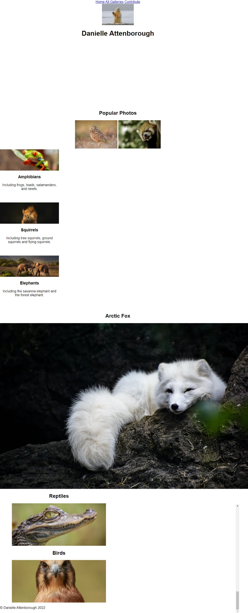
Every image now has the same height, but if we have a look at our preview of the final product, we can see images of different sizes:
Instead of changing the height of all images in one go, let’s start at the top of the page and, working our way top to bottom, resize each group of images.
Step 2
If we take a look at the HTML, we can see that the first image is in the header.
Instead of setting the height of every image to 100px, let’s only set the height of the header image.
To do this, we can combine the header and image selectors, like so:
/* Your CSS here */

-img {
+header img {
	height: 100px;
}
We read this like: “select all the img tags that are in the header tag.
Only the first image will be 100px in height, and the rest will return to their default sizes.
Step 3
Working our way down, the next section has two images:
<section class="row" id="section-2">
    <h2>Popular Photos</h2>
    <div>
        <img src="" />
        <img src="" />
    </div>
</section>
These images are both in a div, then in a section with id section-2.
Just as we did earlier, we can combine these selectors to specify only these two images:
/* Your CSS here */

header img {
	height: 100px;
}

+#section-2 div img {
+	width: 200px;
+}
The next two images will be 200px wide.
Step 4
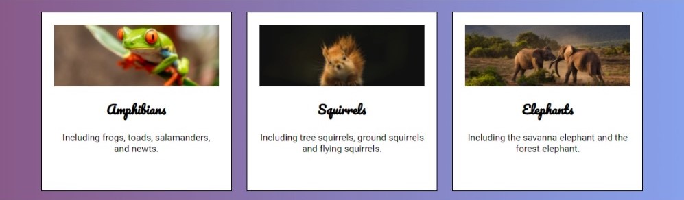
The next three images are a bit different. They are in white boxes, and each have a heading and paragraph to go with them:
Let’s take a look at the HTML to see the structure of this part of the page:
<section class="row" id="section-3">
    <div class="card">
        <img src="" />
        <h3>Amphibians</h3>
        <p>Including frogs, toads, salamanders, and newts.</p>
    </div>
    <div class="card">
        <img src="" />
        <h3>Squirrels</h3>
        <p> Including tree squirrels, ground squirrels and flying squirrels.</p>
    </div>
    <div class="card">
        <img src="" />
        <h3>Elephants</h3>
        <p>Including the savanna elephant and the forest elephant.</p>
    </div>
</section>
Notice how these white boxes are all the same height?
Let’s add some CSS for this.
From the HTML above we can see that each box is in a div with the class card.
Add a height to each of these cards:
#section-2 div img {
	width: 200px;
}

+.card {
+	height: 250px;
+}
Well, that definitely did something, but it did not resize the images.
Add the following to your CSS to now resize the images:
.card {
	height: 250px;
}

+.card img {
+	height: 40%;
+}
The images in the cards should now all be the same height.
The way we set the height of these images is a bit different to what we did previously.
Rather than specifying a value in pixels, we gave a percentage.
This CSS is saying “set the height of this element to be 40% of the height of its parent (where parent means the element it is in, in this case, that is the card).
This only works when the parent element has a specific size set.
Try removing height: 250px from the .card to see this for yourself!
Step 5
So far we have just been setting the height, but we can actually set the width using the same format. Let’s modify our CSS to also set the width of the cards and their images.
.card {
	height: 250px;
+	width: 25%;
}

.card img {
	height: 40%;
+   width: 100%;
}
The images should now be as wide as the cards.
Our cards aren’t side by side like they are in the preview - don’t worry! We’ll get to that soon!
Step 6
This one is a challenge for you!
Find the image in the section with id section-4 and set its width to 400px.
Step 7
The last section is section-5 and has two images side by side.
Let’s take a look at the structure of the HTML:
<section class="row" id="section-5">
    <div class="column" id="left-column">
        <h2>Reptiles</h2>
        <img src="" />
    </div><!--
    --><div class="column" id="right-column">
        <h2>Birds</h2>
        <img src="" />
    </div>
</section>
Each of these images is in a div with class column.
Eventually, these columns will be side by side, which means they need to be 50% wide each in order to fit beside each other.
Set the width of the divs with the column class to 50%.
We will then resize the images inside of these columns.
For images inside the divs with the column class: set their height to 200px and their width to 80%.
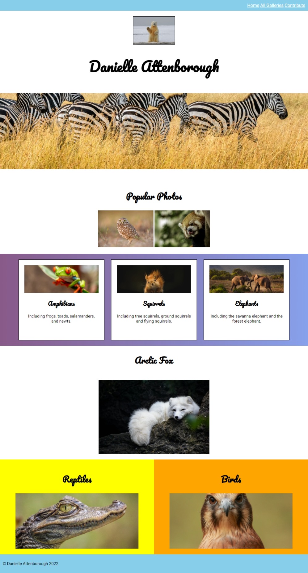
Here’s what your page should look like at this stage: