Layout
Ok, so our images are now at a much more manageable size. The next thing that we are going to do is figure out how to modify the layout of elements, e.g. put our cards side by side, etc.
Once again, we’ll start at the top of the page and work our way down, using our preview as a guide:
Step 1
First, the nav.
In the preview, the text is on the right of the page.
We can achieve this effect using the text-align property.
Add the following your CSS:
/* Your CSS here */

+nav {
+	text-align: right;
+}
The nav text should now be on the right.
As we go through this tutorial, you’ll start to see that every CSS property has many different values. We’ll link to some docs here and there to show you all the different values if you are interested. For example, here are all the values for text-align .
Add CSS to set the header and main elements' text-align property to center.
Step 2
Next up, let’s get those cards to be side by side.
Add the following to your CSS:
.card {
	height: 250px;
	width: 25%;
+	display: inline-block;
}
The cards should now be side by side.
Let’s unpack that.
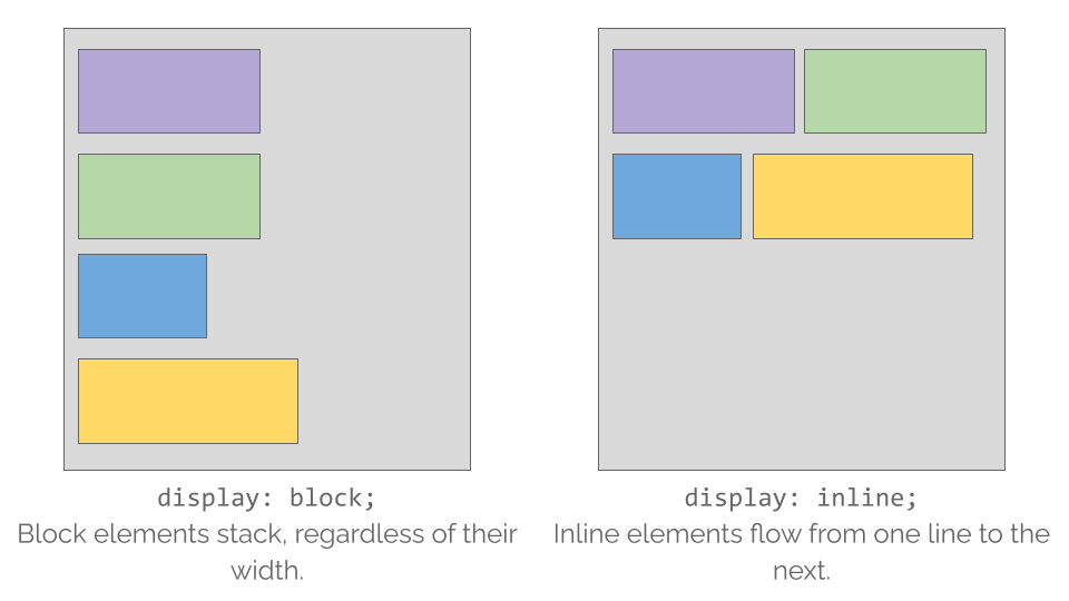
There are several different values for display, but right now we’ll just focus on three of them:
display: block- This tells the element to take up the whole line, stopping anything else from displaying beside it.
display: inline- This tells the element to allow other elements to be displayed beside it.
display: inline-block- This is the same as inline, but allows you to also specify the width of the element.
When we set the cards to be inline-block, we told them they can be side by side while still maintaining the width we set earlier of 25%.
Step 3
The cards are side by side, but they aren’t quite aligned evenly.
Add the following to your CSS to vertically align them next to each other:
.card {
	height: 250px;
	width: 25%;
	display: inline-block;
+	vertical-align: middle;
}
Modify the .column elements to be inline-block.
Here are some docs on vertical-align if you would like to see what other values are available.
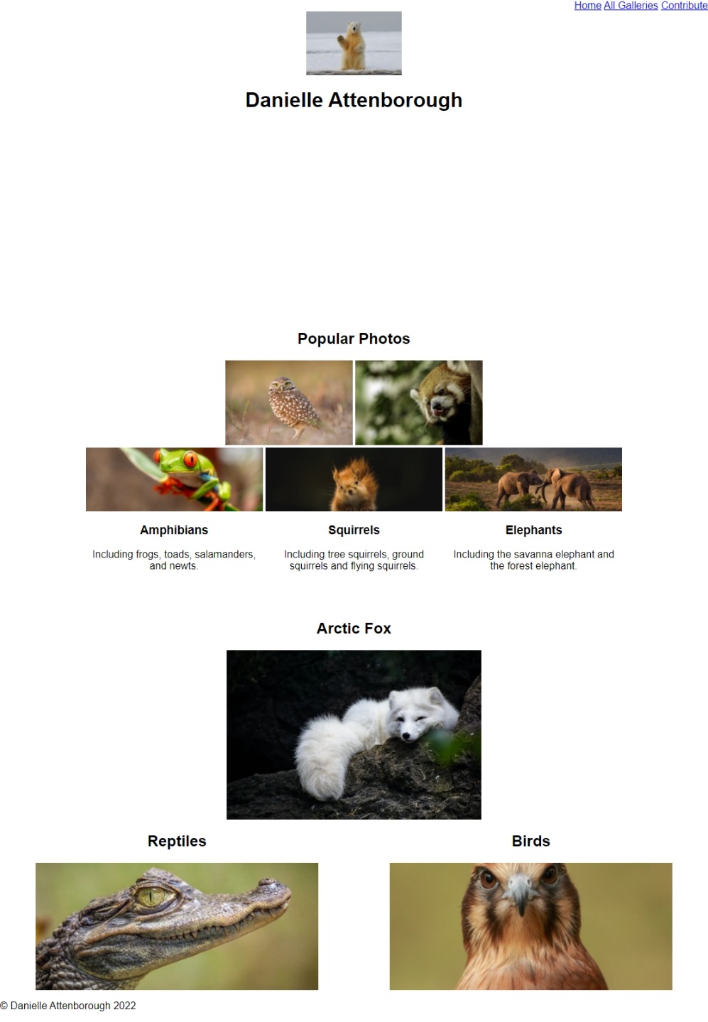
It’s really starting to come together now! Here’s what your page should look like so far: